
IT:
Nella location di Palazzo Trussardi, debutta durante la Milano Fashion Week la prima collezione dell’omonimo marchio con i nuovi direttori creativi, Benjamin A. Huseby e Serhat Işık.E’ iniziata così una nuova era di rebranding dello storico brand fondato nel 1911. “La maison Trussardi è stata trascurata per tanto tempo, come una bella addormentata per quasi un quarto di secolo.” spiegano Benjamin A. Huseby e Serhat Işık “Con questa metafora in mente, abbiamo voluto creare una nuova narrativa fatta di un insieme di fiabe fantastiche e di codici stilistici reali di come la gente si veste per le strade di Milano. Questo gioco fra fantasia e realtà, tra storico e presente, è diventato la chiave per dare vita a un linguaggio Trussardi ben definito.”
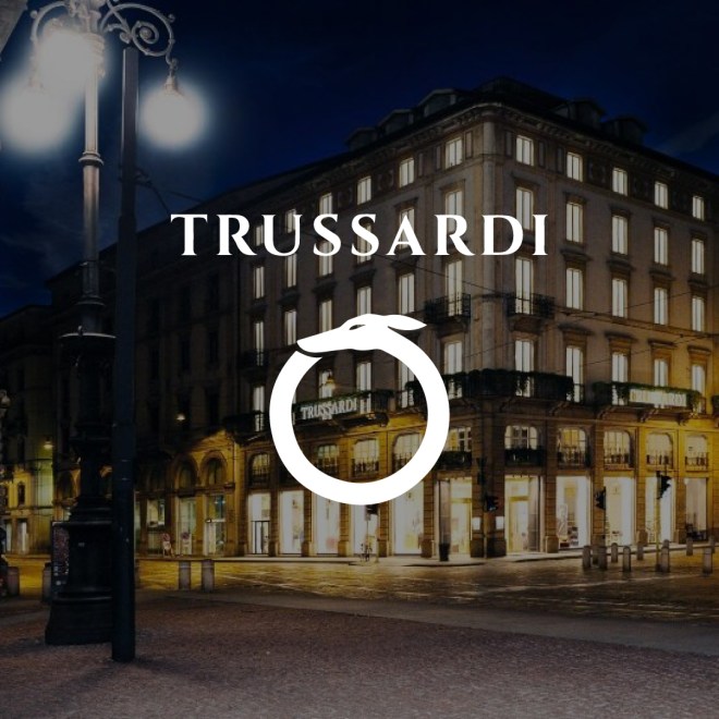
Una nuova Identity del marchio Trussardi è il primo passo verso un nuovo inizio, partendo dall’iconico levriero, simbolo del brand introdotto nel 1973, reinterpretato in chiave contemporanea e timeless per dare vita al rilancio della maison.
Dal carattere più incisivo, il nuovo logo Trussardi viene rivisitato con forme armoniche e una spaziatura più ampia con l’intento di creare qualcosa di nuovo ma allo stesso tempo fedele all’originale.
Il logo si ispira all’heritage Trussardi dagli anni 70 agli anni 90, Il levriero italiano, scelto come emblema del marchio oltre 40 anni fa per la sua inconfondibile eleganza, ora si evolve diventando un elemento grafico circolare, per rifarsi all’uroboro, simbolo dell’eterno, ciclico rinnovo della vita.
Raffigurato di profilo, il levriero appare in un movimento dove la caratteristica forma del suo orecchio segue la testa in una visione d’insieme armoniosa.
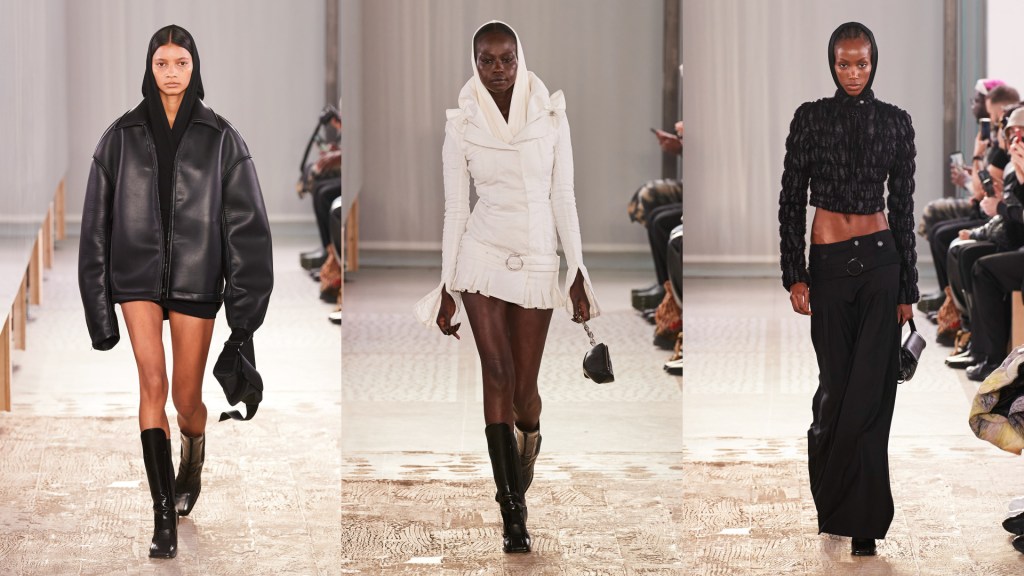
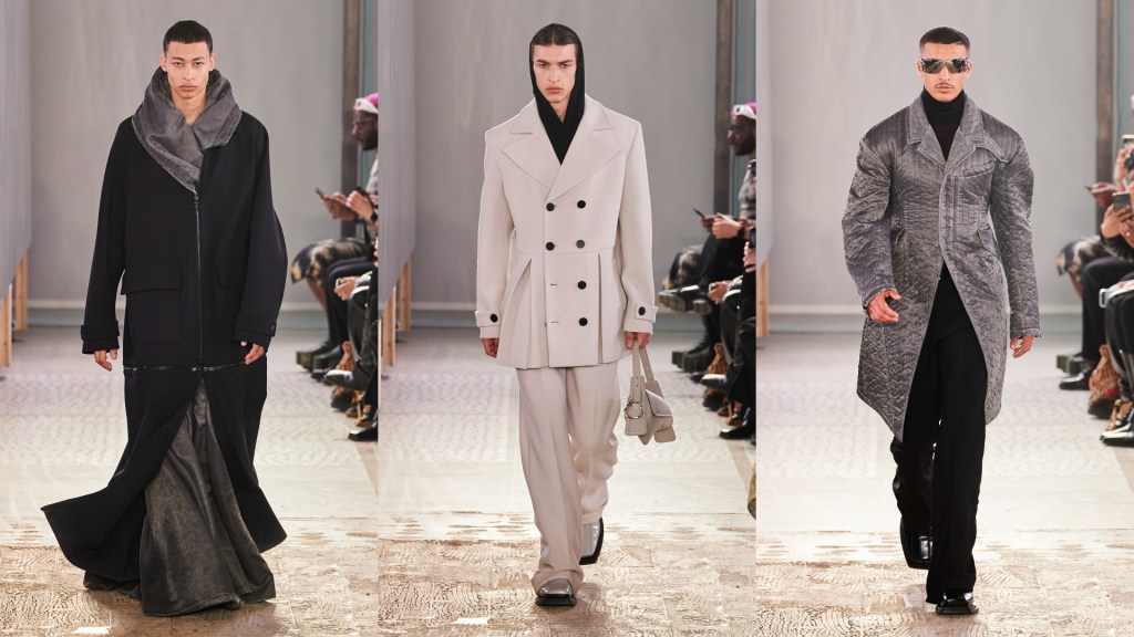
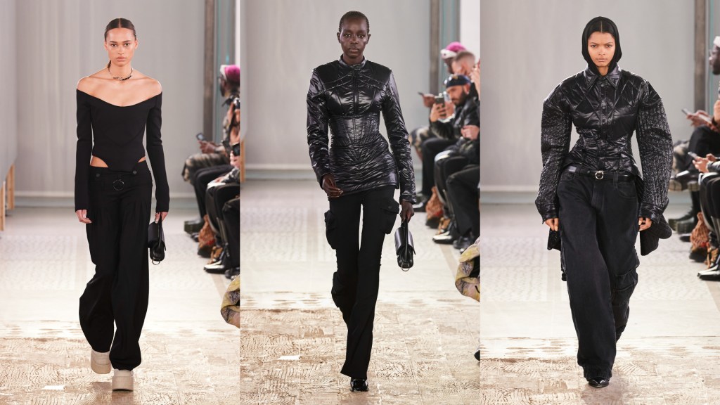
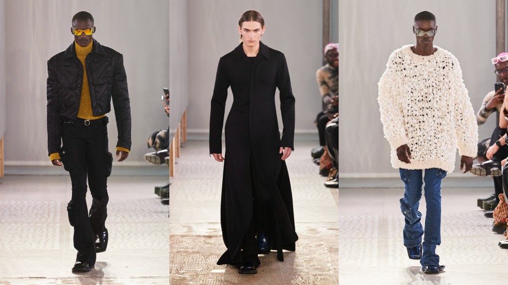
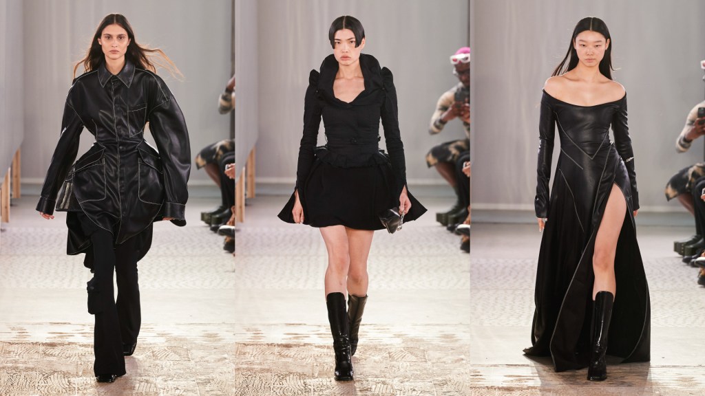
Benjamin Alexander Huseby e Serhat Isik raccontano lo stile italiano partendo da capi cult che compongono il guardaroba quotidiano come il piumino leggero da 100 grammi, in versione arricciata. La palette di colori è classica dal nero accostato al cuoio, al grigio cemento e tanto bianco.
______________________________
EN:
In the location of Palazzo Trussardi, the first collection of the homonymous brand debuts during Milan Fashion Week with the new creative directors, Benjamin A. Huseby and Serhat Işık. Thus began a new era of rebranding of the historic brand founded in 1911. ” The Trussardi fashion house has been neglected for a long time, like a sleeping beauty for almost a quarter of a century. ” explain Benjamin A. Huseby and Serhat Işık “With this metaphor in mind, we wanted to create a new narrative made up of a set of fantastic fairy tales and real stylistic codes of how people dress on the streets of Milan. This game between fantasy and reality, between the historical and the present, has become the key to giving life to a well-defined Trussardi language. “
A new Identity of the Trussardi brand is the first step towards a new beginning, starting with the iconic greyhound, the symbol of the brand introduced in 1973, reinterpreted in a contemporary and timeless key to give life to the relaunch of the maison.
With a more incisive character, the new Trussardi logo is revisited with harmonic shapes and wider spacing with the aim of creating something new but at the same time faithful to the original.
The logo is inspired by the Trussardi heritage from the 70s to the 90s, The Italian greyhound, chosen as the emblem of the brand over 40 years ago for its unmistakable elegance, now evolves into a circular graphic element, to refer to the ouroboros, a symbol of the eternal, cyclical renewal of life.
Depicted in profile, the greyhound appears in a movement where the characteristic shape of its ear follows the head in a harmonious overall vision.
Benjamin Alexander Huseby and Serhat Isik tell the story of Italian style starting with cult items that make up the daily wardrobe such as the lightweight 100-gram down jacket, in a gathered version. The color palette is classic from black combined with leather, to concrete gray and lots of white.
